AMÉLIA DE MELLO FOUNDATION
150 YEARS OF ALFREDO DA SILVA
A new brand identity and the implementation of a vast communication program for the initiatives around the commemorations of the 150th anniversary of the birth of Alfredo da Silva.
BRAND IDENTITY | GRAPHIC DESIGN | COMMUNICATION MATERIALS
The 150th anniversary commemorations of the birth of Alfredo da Silva unfolded into a vast and ambitious plan of initiatives that took place between June 2020 and June 2021.
These initiatives aimed to strengthen knowledge about the life and legacy of the entrepreneur, who built a group that included companies such as the Companhia União Fabril (CUF), Tabaqueira, Estaleiro da Rocha Conde de Óbidos (later Lisnave), Banco Totta and the Companhia de Seguros Império, showing the impact of his work to this day and its influence on the work that his heirs continue to pursue for the economic and social progress of Portugal.
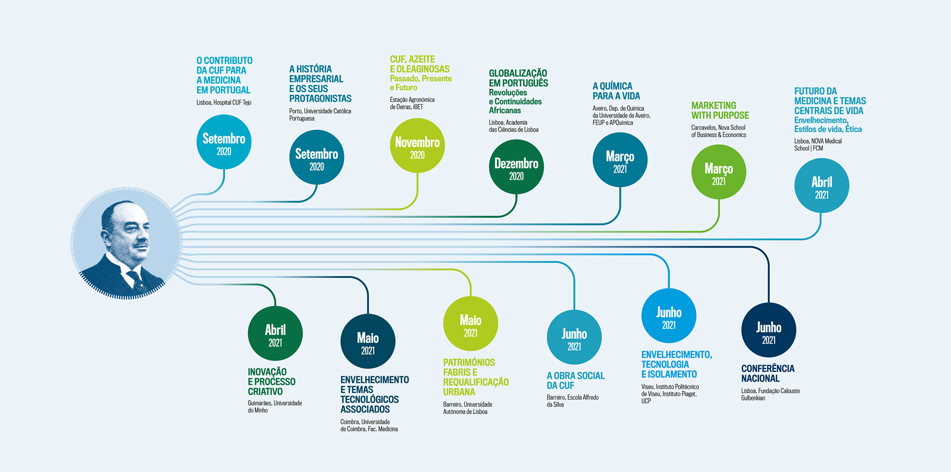
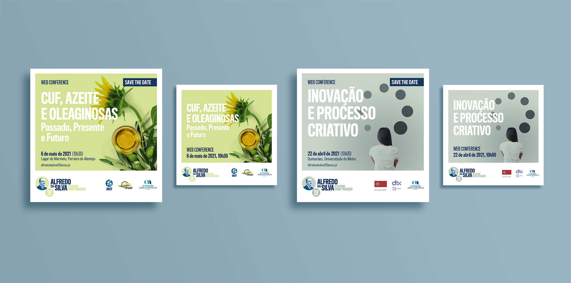
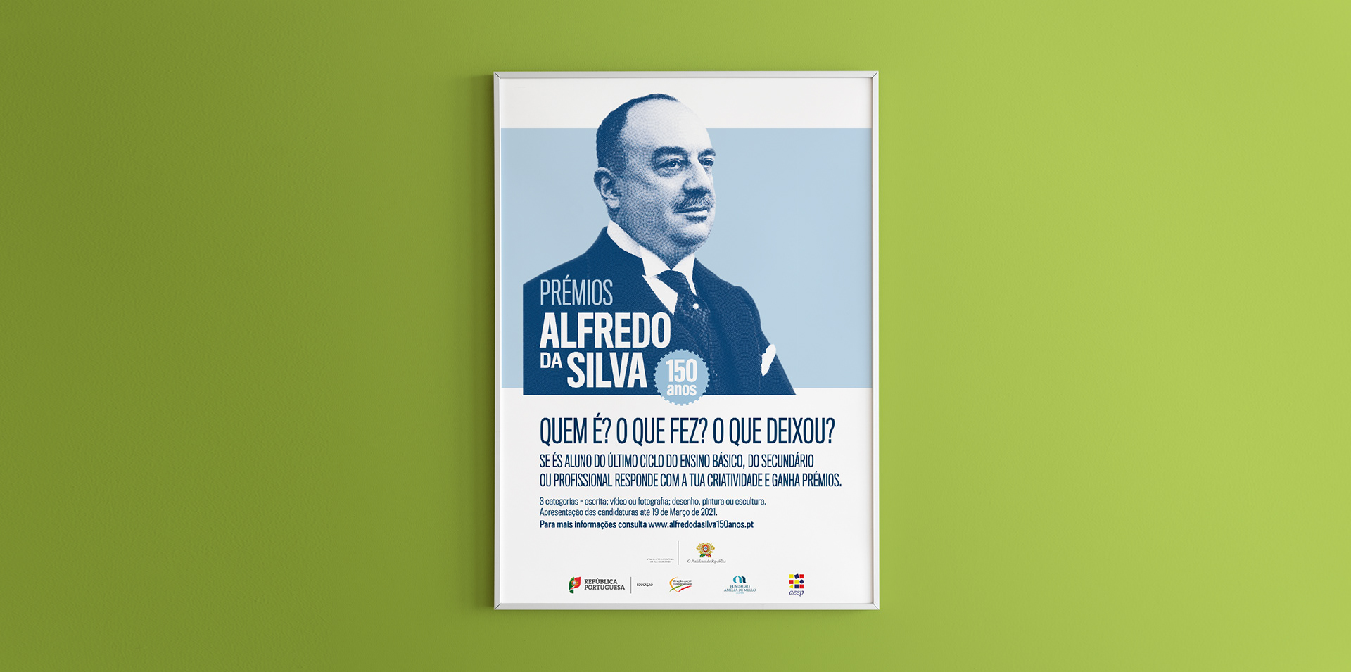
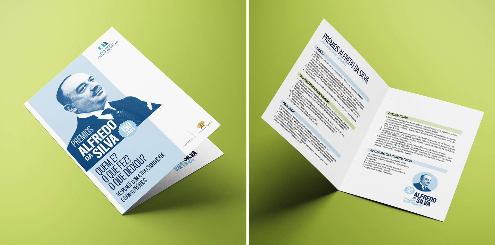
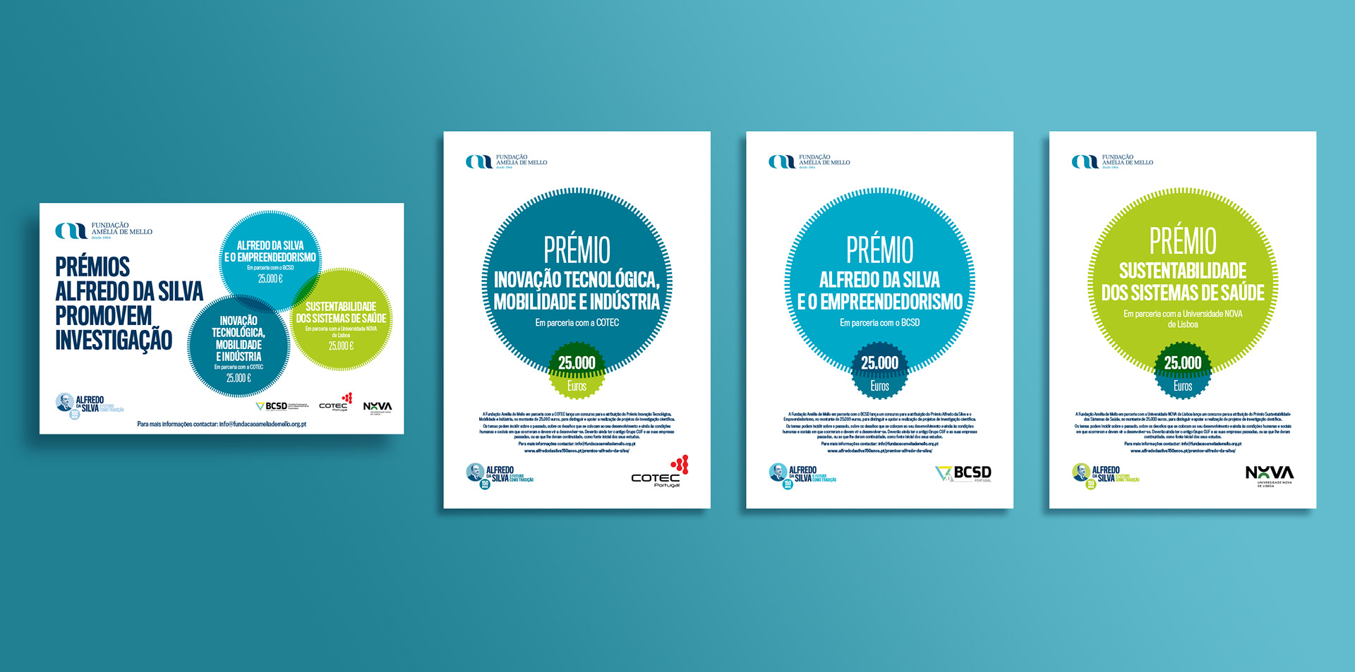
Involving academia and schools, this plan of initiatives included thirteen conferences, a competition for young students from primary, secondary, and vocational schools, the awarding of three scientific prizes, support for the development of studies and research, a film about Alfredo da Silva, and the issuance of four commemorative stamps by CTT.
In this way, the Commemorations of the 150th anniversary of the birth of Alfredo da Silva reached society in general, and in particular the younger generation – who may have known less about his legacy and influence on many of the companies and brands that are now part of their daily lives – as well as the academic and scientific community, which developed research work in various areas of activity of the companies that made up the former CUF Group, revealing its importance in the past, in the present, and looking to the challenges that lie ahead.

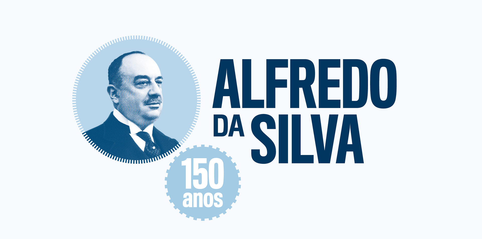
The logo developed for these initiatives was based on the logo of the Companhia União Fabril (CUF). The shape of the cogwheel and the very condensed typography, industrial in nature, are striking in their chosen aesthetics. The highlight of the logo is the image of Alfredo da Silva, applied in the texture of a metal engraving.
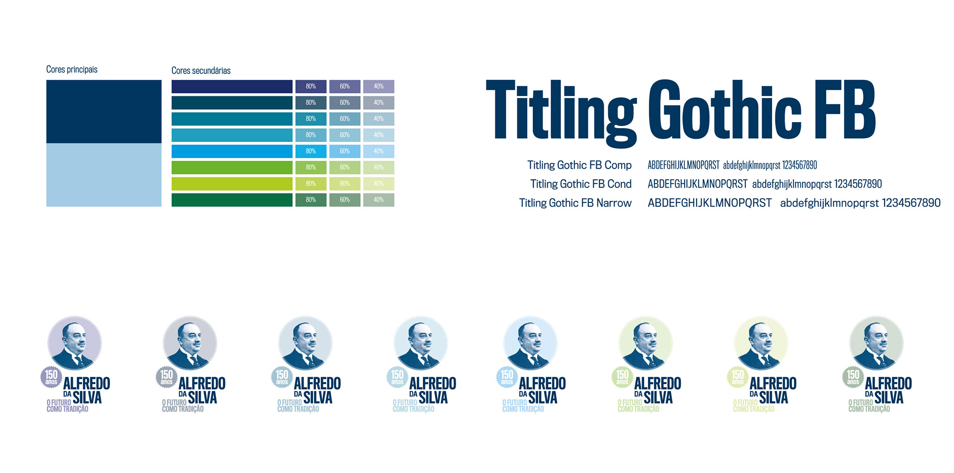
The elements of the logo can be configured in different ways in order to make its application flexible on layouts with different configurations.
The color palette uses shades of blue as main colors and has a set of secondary colors to modulate the graphic communication and support the segmentation of the different initiatives.

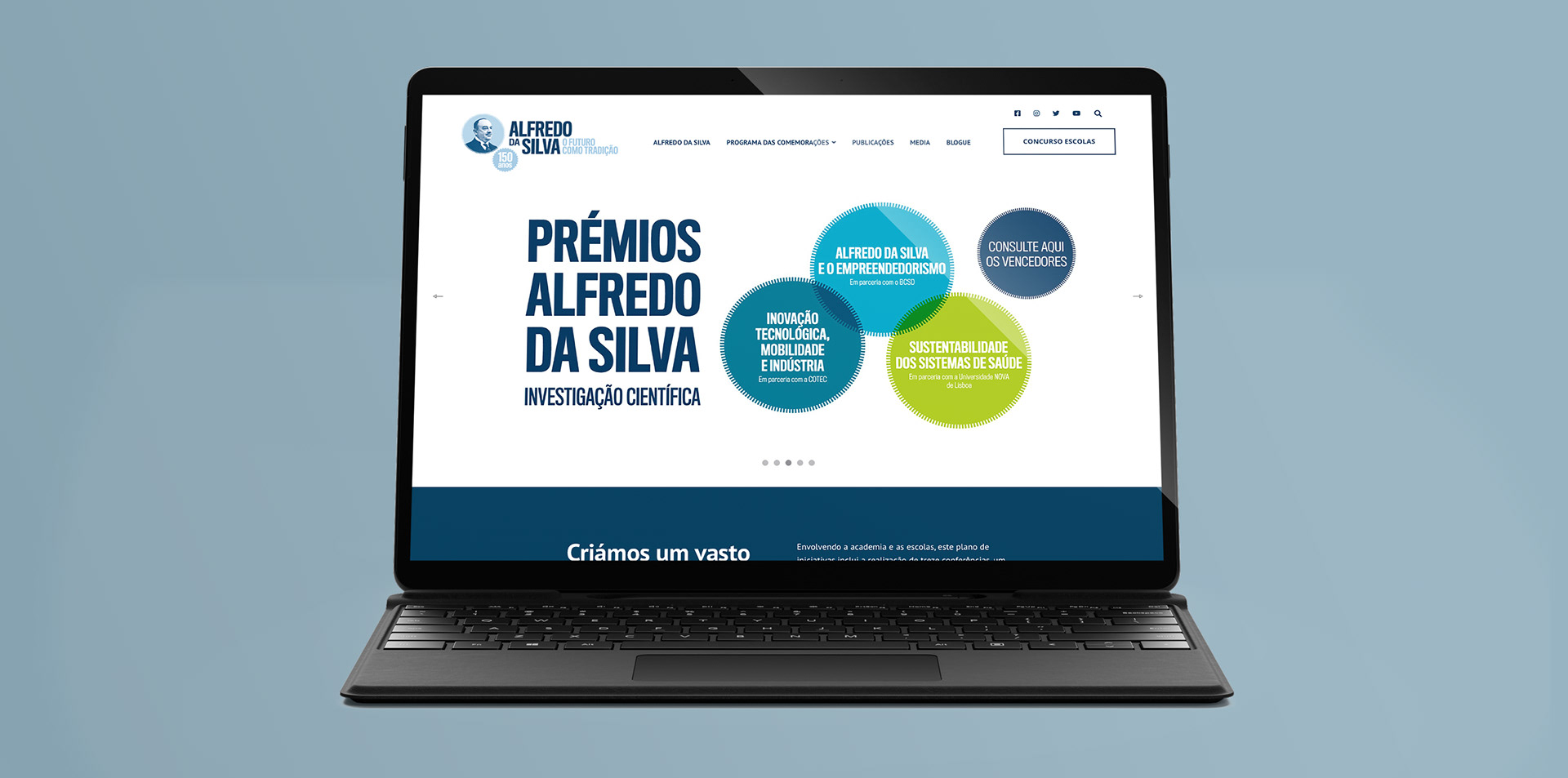
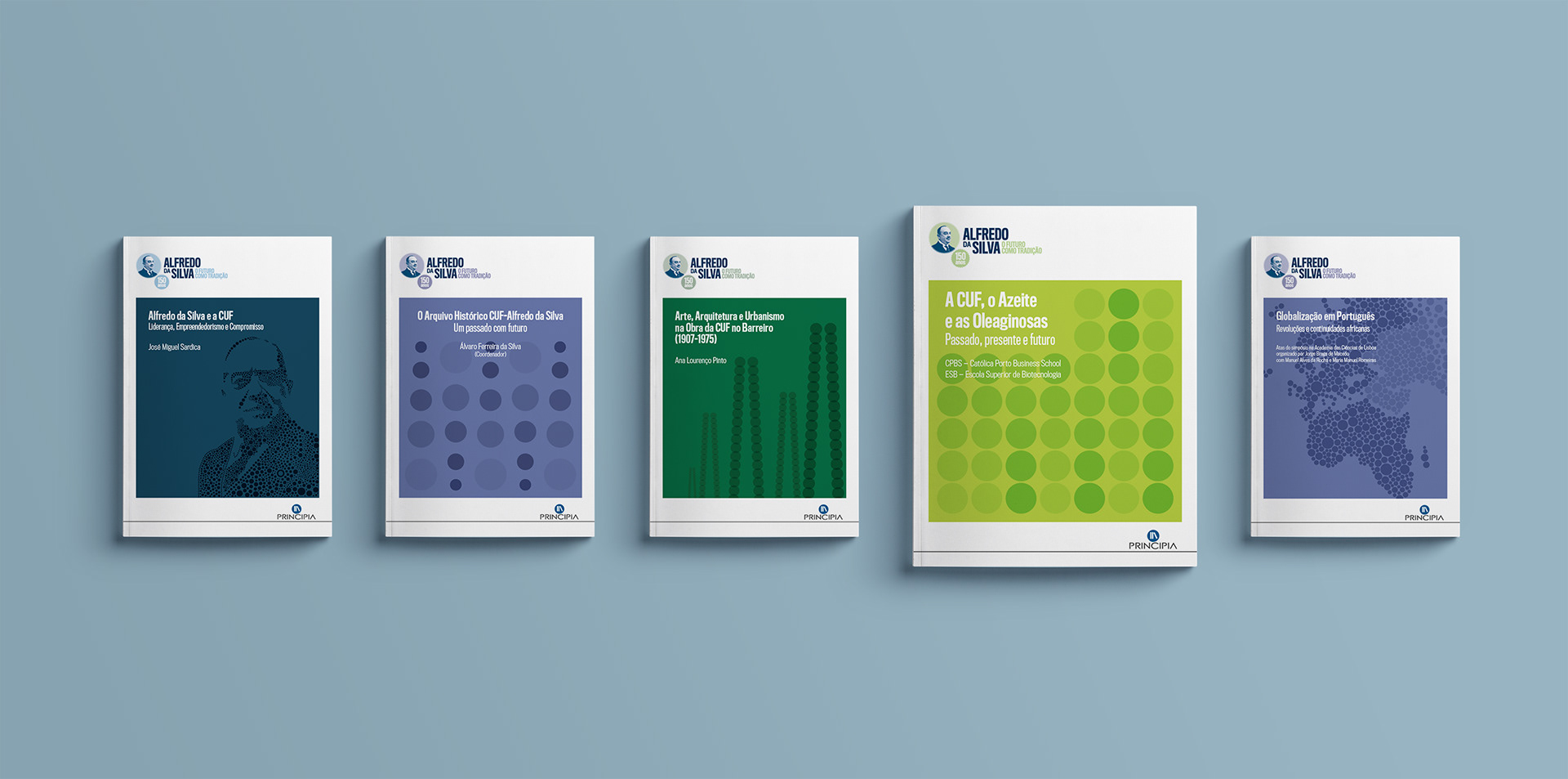
In addition to the identity program, Brand Practice provided the necessary support on the development of communication materials for the conferences, the school competition, and the scientific awards, as well as developing the layout grid and the covers of more than a dozen research books.
CONFERENCES
SCHOOL COMPETITION
RESEARCH AWARDS
RESEARCH BOOKS

Get in touch: