NOVOBANCO
A new brand identity, created from the voice of its employees.
BRAND STRATEGY | BRAND ARCHITECTURE | BRAND IDENTITY | GRAPHIC DESIGN
Brand Practice developed a brand creation methodology based on a collaborative process directly involving novobanco's employees. The goal was to highlight the recovery work that the bank has done in recent years, the result of everyone's collaboration and commitment for the common good.
THE VOICE
After considering many expression options for the collaborative process, the use of voice stood out for its symbolism, engagement and simplicity.
Besides the uniqueness of each person's voice, this solution reinforces the idea that each employee has a say in the process of change and the future of the bank.
VOX APP
The voices were captured through an APP specifically developed for this purpose, the VOX APP.
The APP presented a simple and linear sequence of steps and questions. In response to these questions, waves were generated on screen in real time, modeled by each person’s words and tone.
The aesthetics of these waves was previously defined so that the shapes, colors, and transparencies that each person saw when using the APP presented a sense of relation and graphic consistency with what would be implemented in the brand identity.
As a result, we obtained a very wide set of waves that were used in the implementation of the new identity, giving it an organic and diverse character.
NAME
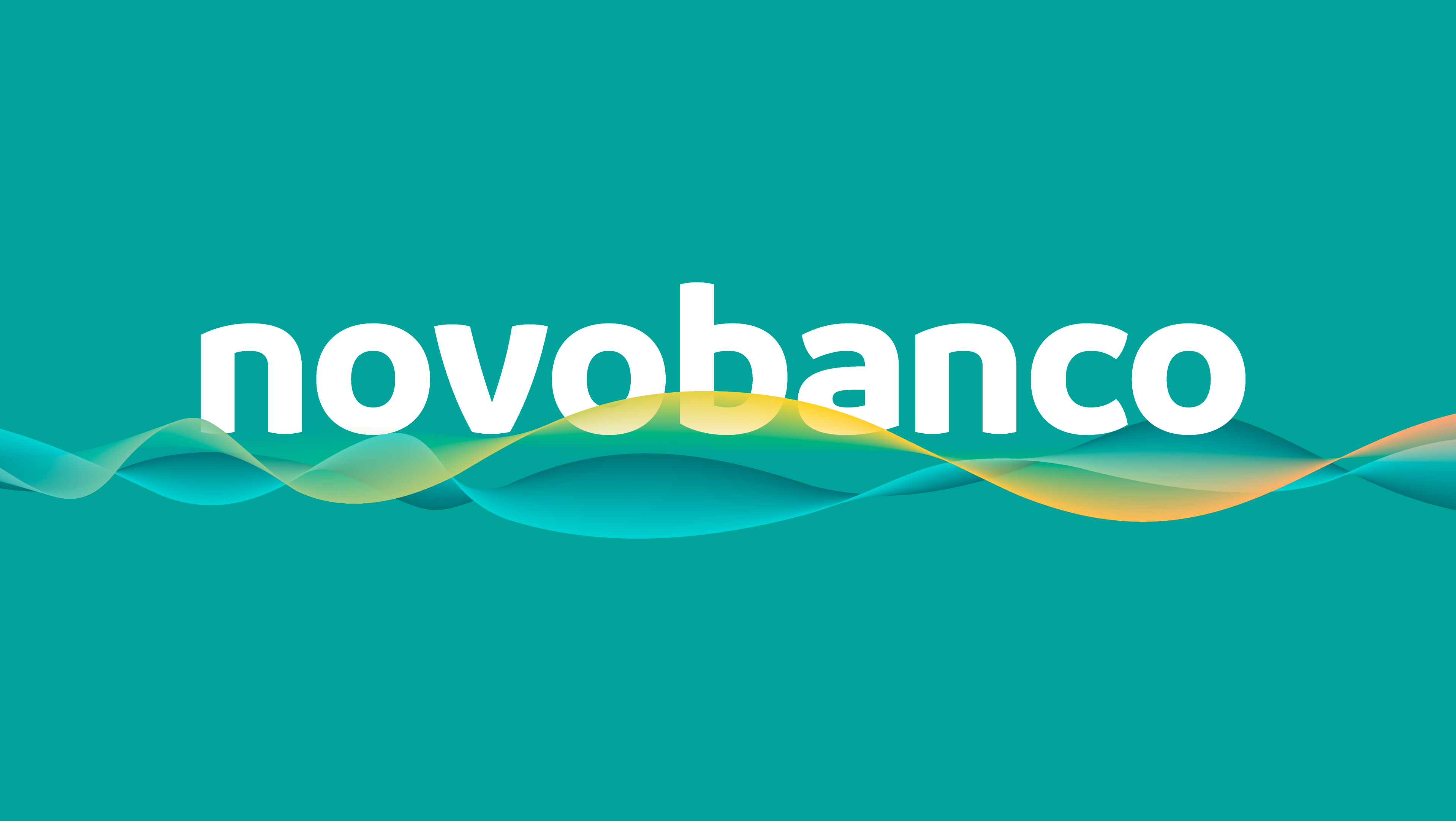
The name "NOVO BANCO" is now "novobanco", a single word, a noun that marks the sense of union and evolution, with pride in the recovery effort made by the organization in recent years. The composition in lower case values the proximity and the relationship established with every audience.
VISUAL IDENTITY
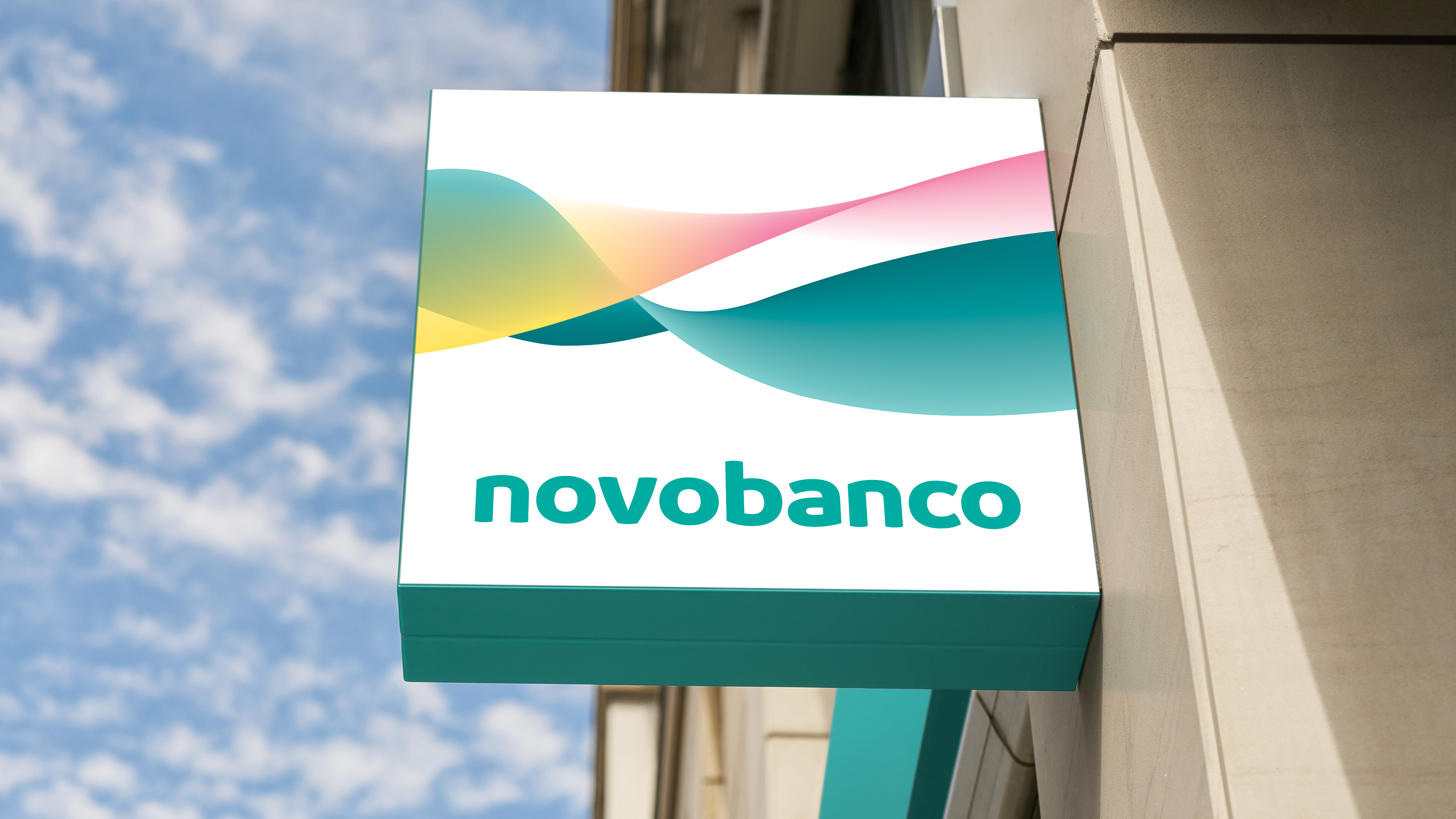
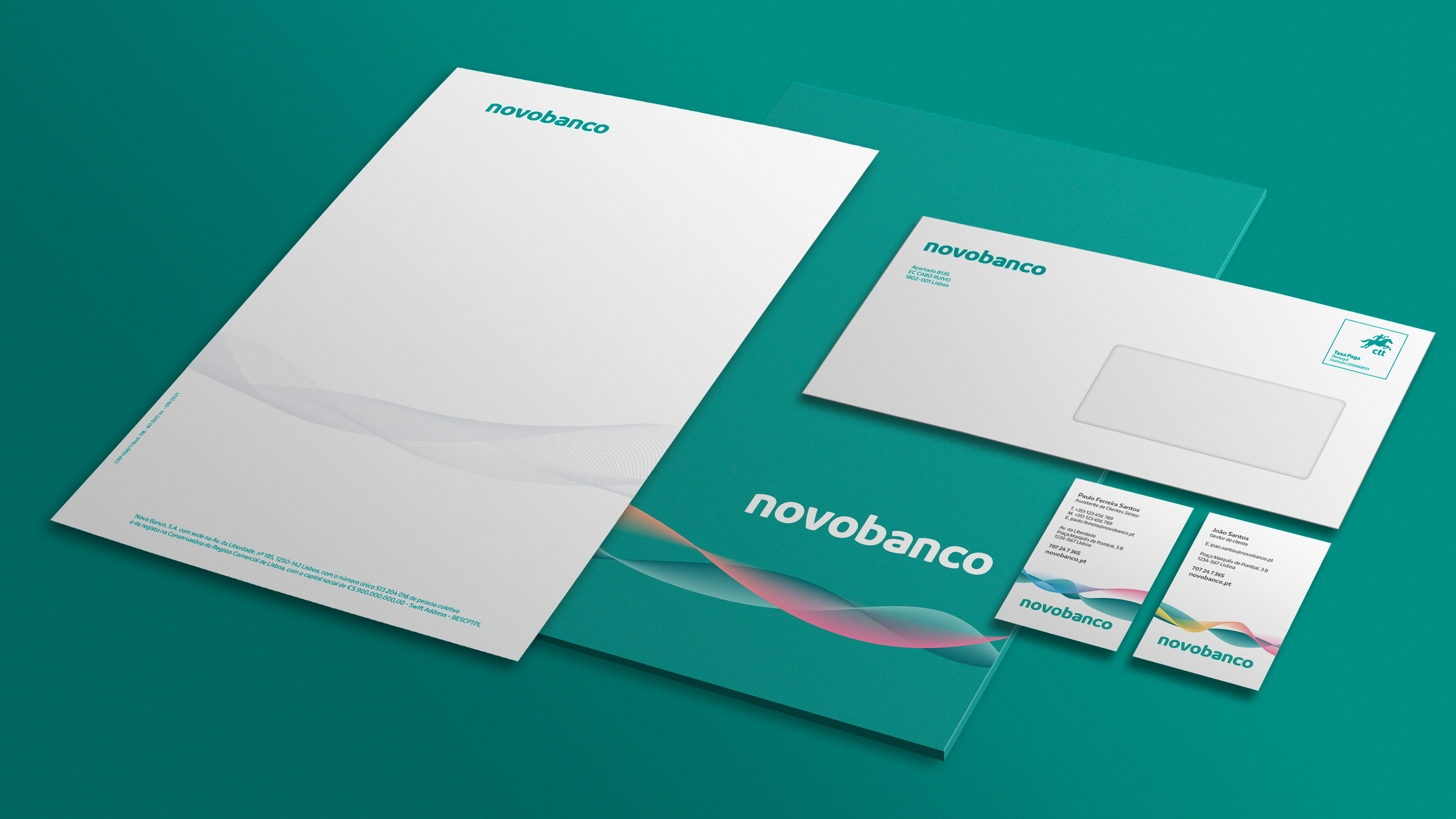
The waves are the focus of the visual identity, presenting characteristics that go far beyond a traditional symbol. Each expression is composed of two waves that relate to each other and interact. The green wave symbolizes the bank and the colored wave the people.
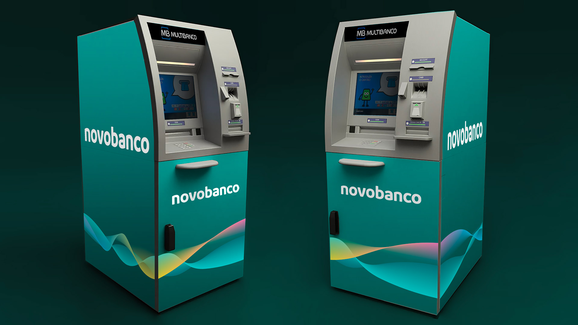
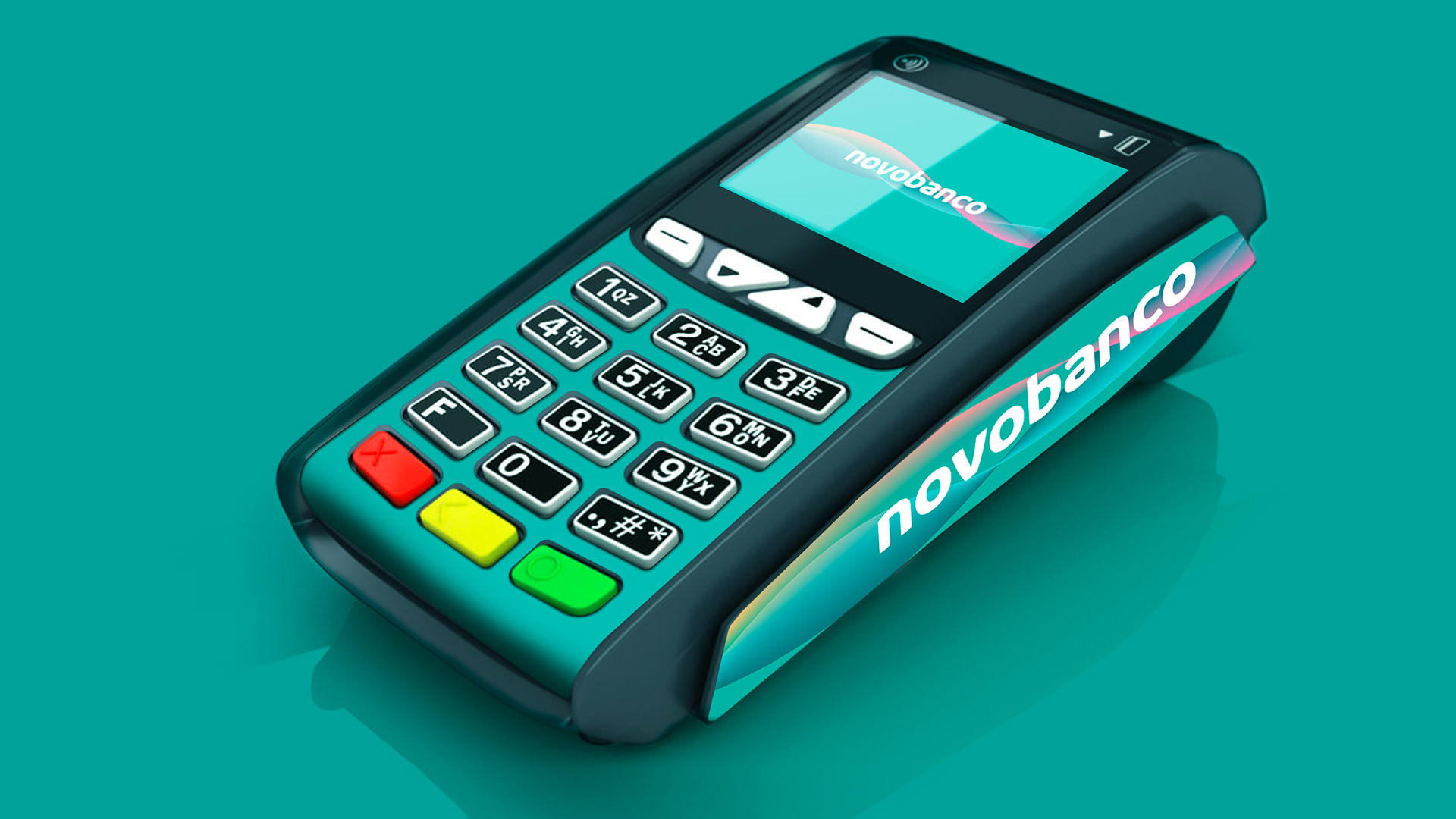
Implementation of this element is always made to reach from one end of the layout to the opposite end, giving a sense of evolution and continuous improvement. The waves are integrated into the elements of the images, photographs, or typography, taking part in the narrative.
COLOR
Green has been preserved as the main color, although with a hue evolution. The color has matured, preserving its unique and distinctive character, important as an immediate identification element for a brand with a strong presence on the streets.
In addition to the Main Green, the palette has a set of complementary and secondary colors, relevant to highlight the different brand segments and to provide graphic flexibility in digital and printed media.
In addition to the Main Green, the palette has a set of complementary and secondary colors, relevant to highlight the different brand segments and to provide graphic flexibility in digital and printed media.
TYPOGRAPHY
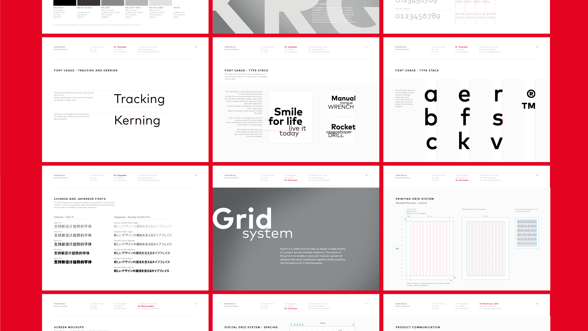
Typography plays a fundamental role in brand identity, both for the personality it brings to the brand and in structuring the brand architecture.
In order to create a unique expression – fully adjusted to the brand's strategy and communication needs – DSType Foundry was commissioned to develop a new typography.
In order to create a unique expression – fully adjusted to the brand's strategy and communication needs – DSType Foundry was commissioned to develop a new typography.
The new typography has a base variant, to be used exclusively in the main brand and sub-brand logos, and a text variant, for standard use in communication.
The typeface family was developed in Light, Book, Medium, and Bold, with corresponding Italics. These four thicknesses are sufficient to cover the main needs, providing great versatility in digital and printed media. The typography presents special care with some important features for a bank's brand such as Tubular Lining, Ligatures, etc.
Its design features curved lines in the apexes, bars, and legs, producing a harmonious aesthetic with the waves.
SOUND IDENTITY
The project relied on the artist Moullinex for its sound identity. His participation was extremely important since he developed an original musical composition, in line with the central idea and values of the brand.
The main musical composition was adapted to different media and communication needs.
BRAND ARCHITECTURE
The visual identity has the flexibility to communicate specifically with each of the four market segments – mass market, affluent, small businesses, and corporate – as well as to communicate institutionally.
The principles for creating product brands have been revised. From now on, products do not have logos and their names must be descriptive, simple and in Portuguese.
Channel brands were abandoned and an omni-channel concept was implemented seeking to provide a unique banking experience.
BRAND APPLICATIONS
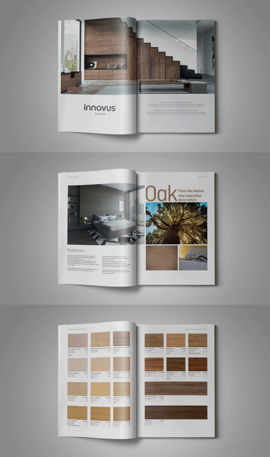
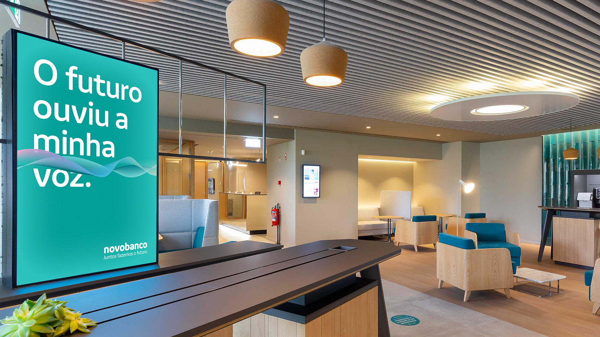
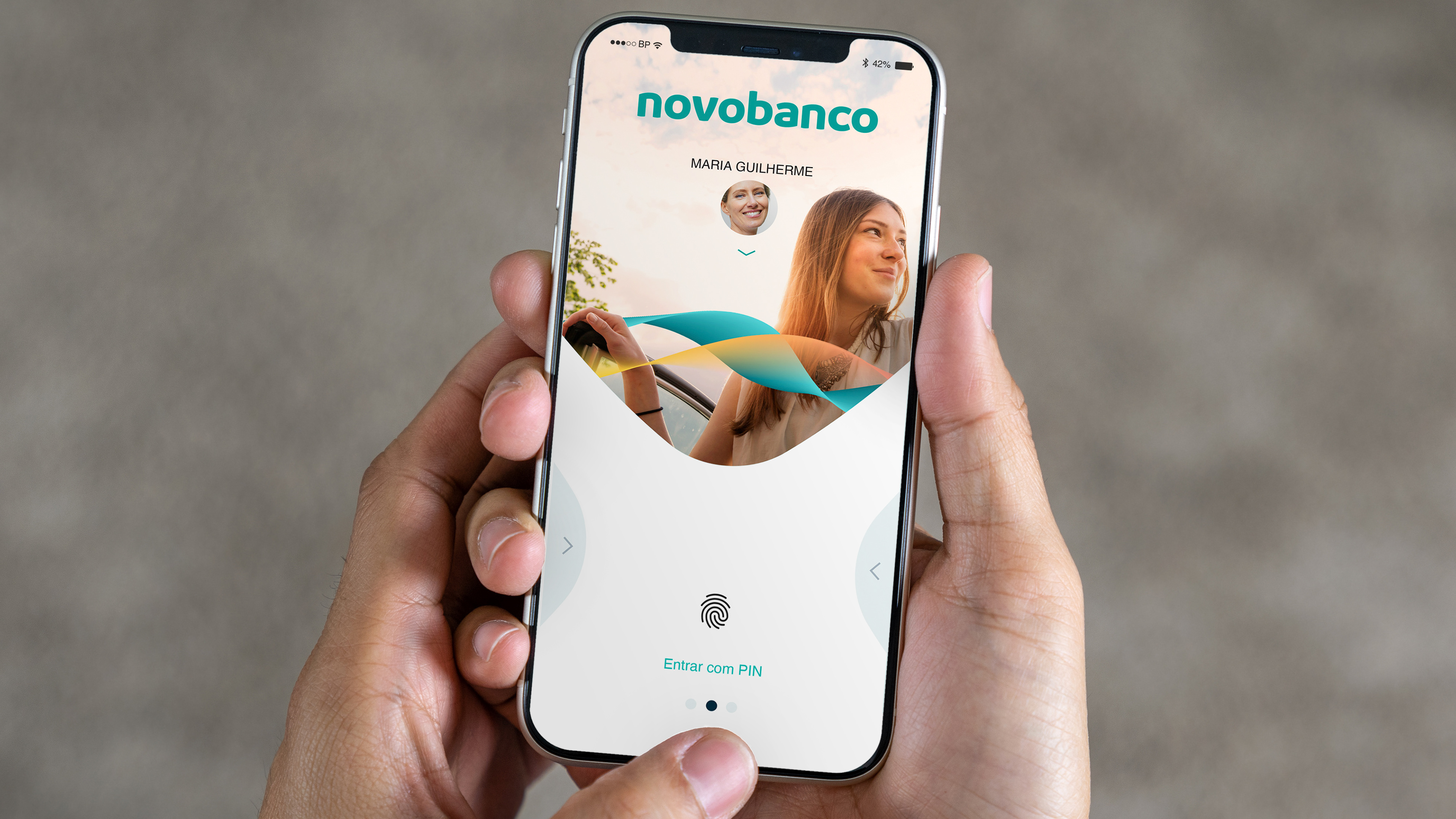
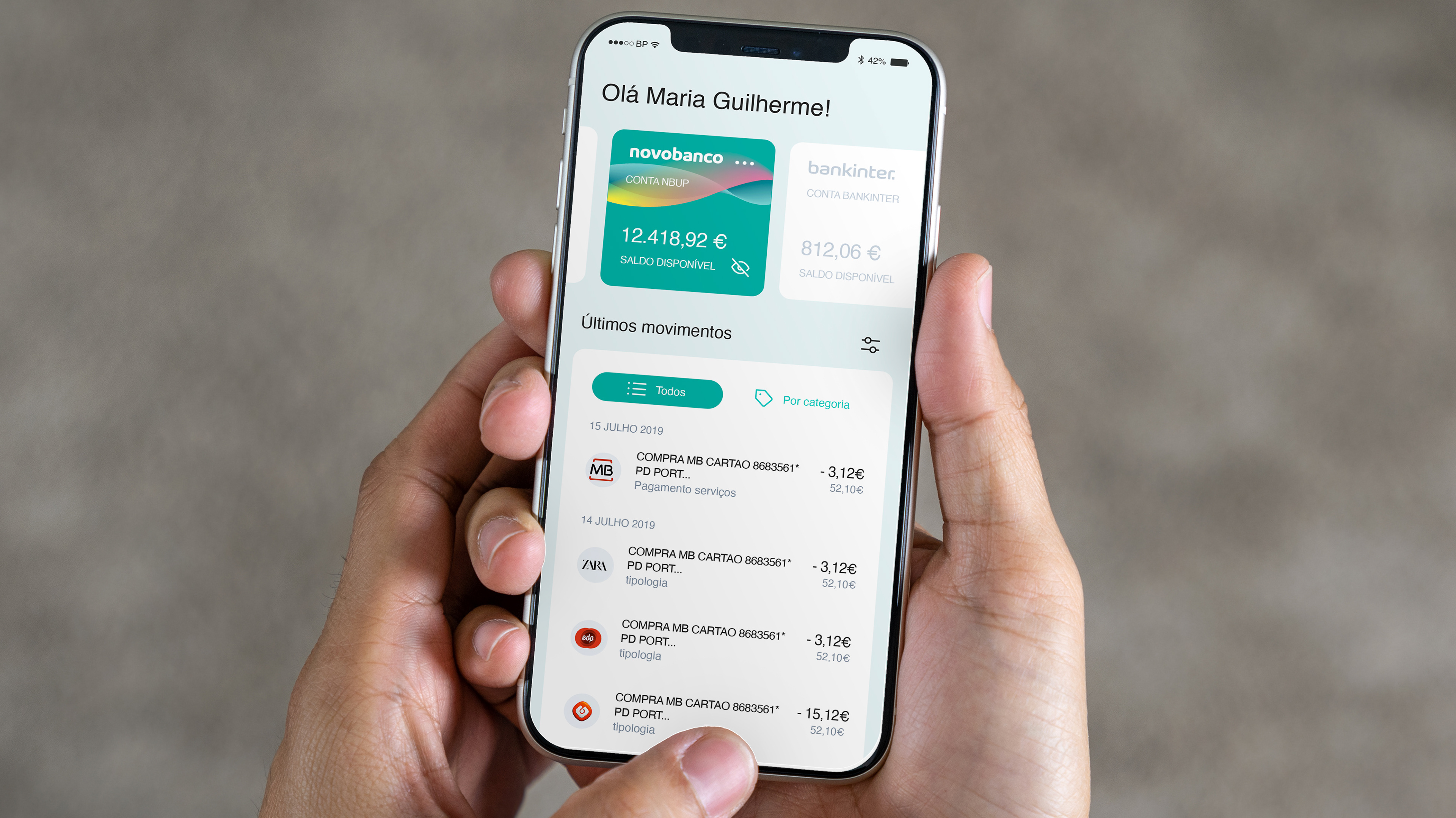
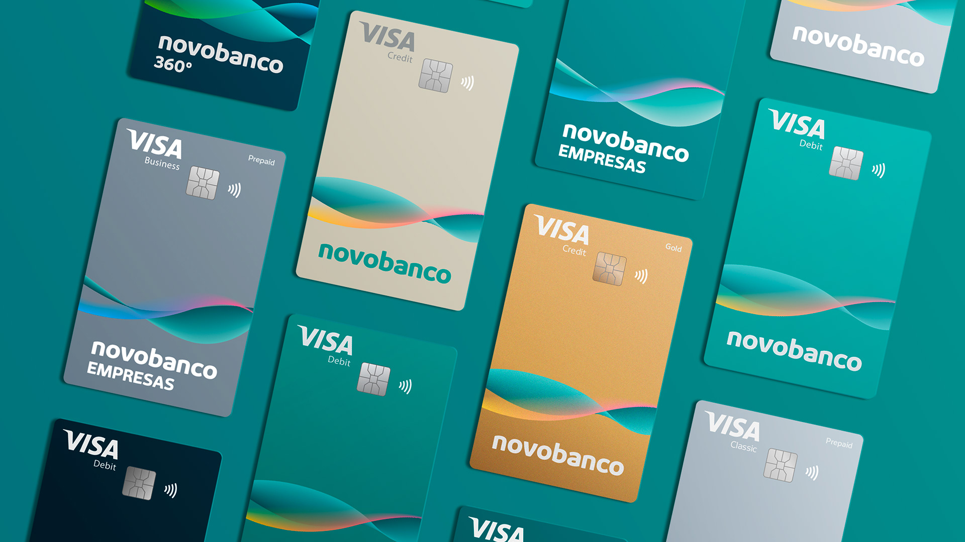
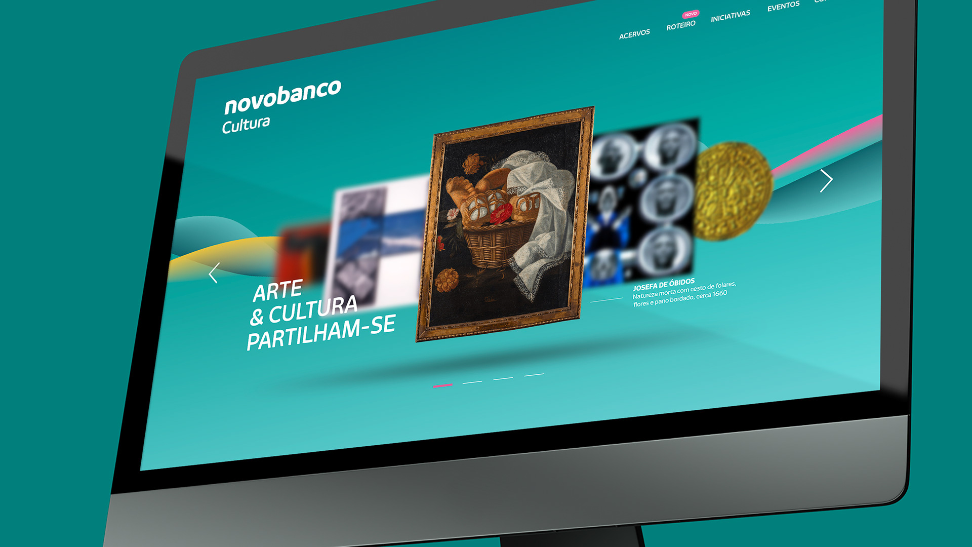
Additionally, Brand Practice has developed a wide range of applications and communication materials, fundamental for the implementation of this new visual identity and brand experience.

This project was developed in partnership with the advertising agency BBDO Portugal.
Get in touch:
