ESCAPAD
ESCAPAD is an innovative global MVNO aimed at travelers from countries like the USA, Japan, China, Russia, or Brazil visiting European Union countries. It is distributed by travel agencies, integrating voice and data packages without the high roaming costs incurred for non-EU countries. It also provides these travelers with an integrated offering of solutions, promotions, and suggestions to make the most of their stay.
BRAND STRATEGY | BRAND IDENTITY
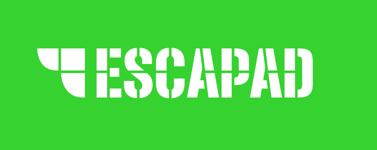
Brand Practice created the brand identity and a set of communication supports. The logo is focused on the symbol of soaring wings, referring to the flight associated with travel, combined with the “E” of ESCAPAD. The compositions of geometric pieces of the symbol and lettering give the logo an idea of technology and rigor, reinforcing the perception of reliability of the service.
The chosen color marks a distinctive chromatic territory in the field of telecommunications; it also establishes the connection to ecological and sustainability causes, one of the main axes of the brand positioning.


Get in touch: